An Introduction to Fine Art Printing by Richard Young
11 Oct,2022
“A quality fine art print is a thing of beauty, a creation that takes time and skill—where the expressive approach of the photographer marries with the art of printing to produce a representation of a work that cannot be experienced in the same way in any other form. The process of its creation—the printing workflow—should not be rushed, it should be enjoyed and guided with the same intent as the capture of the original photograph”. - Richard Young
Printing has always been a hugely important part of my photography, right from the beginning of my journey as a landscape photographer. When I started to print my work, it quickly turned into the end goal for most of my photography in the form of fine art prints for exhibitions and gallery sales. Printing is often considered a bit of a dark art, and over the last few years, I have helped many people simplify the process in my printing workshops along with focusing even further time on refining my hand in the art of printing. In this article, I will share with you an introduction to the art of printing.
The Importance of Printing
I feel a digital image never truly becomes a “photograph” until it is in a printed form, and neither is the creative process complete until it is printed. Yes, I share my work with others via a variety of digital platforms, we must nowadays! Alas, one of the biggest problems with these platforms is the lack of consistency when viewing digital images. Often images look very different depending on the device they are displayed on, or a differently edited version of the same file.
When I print an image, it is final. It will stay in that form (as long as the right archival substrates are used). I can share it with others safe in the knowledge that they are seeing my image being represented in the way that I intended. When I sign a finished print, it is my way of saying that I am happy with this finished piece of work, or at least I was at the moment I signed it! Over time my vision of the photograph may still change, and I could still return to the digital file to make further edits to the master print file or reprint on an alternative paper to achieve the look I desire. This is part of the process that enables a constantly evolving photographic vision and growth as an artist.
The trend toward sharing our images on digital devices and via social media platforms has taken over from the printed image as a finished photograph. However, due to the digital world we now live in, there has never been a more important time to print your work. Today we see so many images in our day-to-day lives that we don't spend enough time properly appreciating them - flicking through Instagram posts, a split second per image.
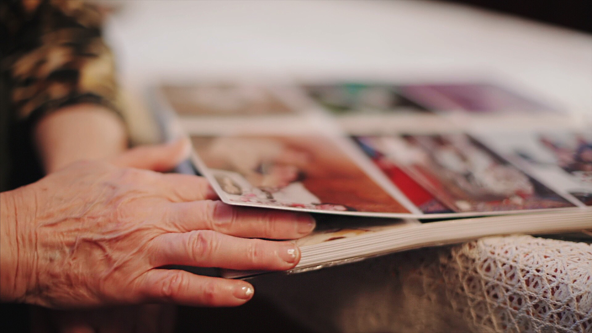
When you hand someone a printed image, they will take the time to look at it in detail. Having more time to reflect on one photograph allows us to fully appreciate its beauty, composition and the story the photographer was trying to tell. Subtle images alongside ones that rely on small details within the photograph often work great as prints. These images can hold our attention and make us look deeper into the photograph and appreciate its fine details. This is something which is very hard to achieve when sharing images via social media, since every photo requires a strong initial impact to gain attention on the tiny generic screens they are presented on.
Fine Art Printing
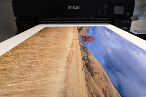
A (digital) “Fine Art Print” is an image printed from a digital file, using the best archival pigment inks onto acid-free Fine Art paper to ensure its longevity as a piece of artwork. It is printed with the latest printing technology, using a “Fine Art Printer” which will likely have an ink set of 8 or more inks, which provides a large colour gamut and offers the finest reproduction of the digital image as a printed work.
Printing is often considered a dark art, requiring very in-depth technical knowledge to achieve. With terms like colour space, ICC profiles, resolution, both PPI and DPI (which are not the same thing!) it is easy to see why. However, printing doesn’t require as much in-depth knowledge as one may presume. Frustration might come from your first printing experience, with your prints may initially coming out too dark or with incorrect colours. Try not to stress, often these issues are easily fixed by a good colour management workflow—using a calibrated screen and the correct ICC profiles for the printer and paper you are using. If you get setup right, you should be able to accurately proof the image before printing it, thus saving you time, money and frustration.
Printing with labs
When starting out printing your images, printing labs can offer a great introduction to the process, with the lab taking care of some of the end settings. Be aware, though, that they are only going to print what you give them. If you don't set up the file correctly, you will still run into the same issues as you would printing at home. If you do print with a lab, choose wisely! High-quality labs do a great job. Cost-effective online printing and/or from large chain stores might seem a cheap option, but their prints are not likely to be “Fine Art” quality prints due to the budget inks and paper used. At large chain stores, the printer might also be operated by someone that knows less than yourself about printing! If you send a file to a high-quality lab or print it yourself with a good colour-managed workflow, and the colours look different on the print versus your screen, the chances are that the print is correct and the screen is inaccurately displaying the colours.
Printing at home
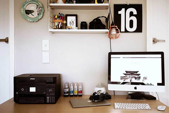
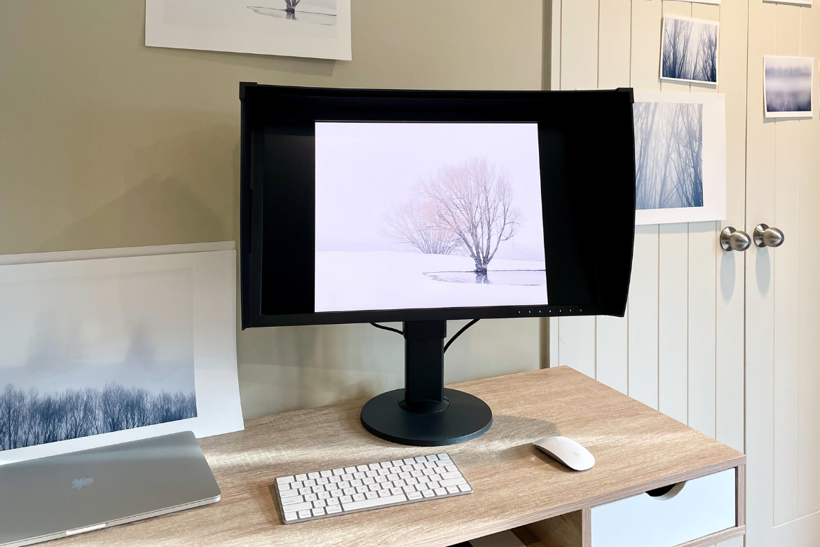
Printing at home can offer much more control and a full understanding of the printing process, allowing the ability to experiment. For me, I love the creativity of experimenting with different paper types and being able to fine-tune a print to perfection, which is extremely challenging if you are not doing the whole process yourself. I have an Epson SureColour P906 set up at home that I use for all of my smaller work (up to A2 sheets/17” rolls). These modem ‘pro-consumer’ printers are easy to operate with basic printing knowledge and produce the same results—in terms of quality and colour—as their larger 24”/44” cousins. One software improvement that has transformed the ease of home printing for photographers is the print module within Adobe Lightroom Classic. Compared to Photoshop, it has made setting up print files much easier, automating a lot of the processes like file size, colour space, and sharpening - allowing you to print directly from your RAW file.
Displaying Prints
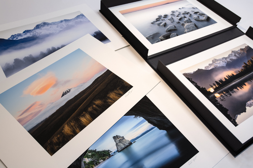
A print is a tangible object: something we can hold, put into a beautiful portfolio or get framed for our wall. People always think they need to print big to get impact, but most of the printing I do these days is done at A3+ or A2 sizes. For portfolio prints, I feel A3+ offers the perfect size print, both in terms of handling and viewing at arm’s length. A collection of these presented in an attractive case is a beautiful way to share your photography with friends and family. Embracing your work in such a manner offers a deeper connection to the viewer.
Framing is another great way to display your photography as a piece of artwork. While there are many alternative framing methods available today, I think that classic traditional framing still offers one of the best options. An A2 print framed with a nice matt board offers a finished size of 800m x 600mm, which makes a really nice medium-size print for at home. Choosing to display two or three of these on a large wall space can create a classic look. Of course, if you have huge wall spaces, a single large print or possibly giant panorama print will work well.
Printing Papers
Your choice of paper will have a profound effect on how your final print looks. Different paper types offer a unique way of expressing ourselves in our fine art prints. Every paper has different qualities, and testing which is right for you is a long but worthwhile process. With so many different fine art papers available on the market today, paper choice can be quite confusing. For all of my work, I use Epson’s Signature Worthy Paper. Each paper has a designated different look, and while I have a few favourites, the selection of each paper really comes down to the individual photograph and what look I wish to express in the finished print. Over the next few pages, I’ll share 4 photographs and the paper I selected and why.
Richard Young is a full-time nature & landscape photographer based in Wanaka. His work can be viewed at www.richardyoung.co.nz. He is a Fine Art Printing Ambassador for Epson and has 18 years of experience producing, selling & exhibiting prints as a professional photographer. He teaches printing on 1-day workshops and online.
Epson Premium Luster Paper
For a long time, I have printed my images on luster paper. I love it for my traditional landscape work as the lustre finish is very well-suited for framing behind glass. While this Winter Landscape is not a heavily saturated image, it still features some deep blue tones, which are reproduced well by the very wide colour gamut of this paper.
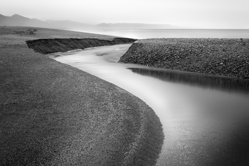
Epson Traditional Photo Paper
For this black and white photograph I made on the West Coast, I chose to print it on Traditional Photo Paper. This paper offers a really high d-max to render deep blacks beautifully. The semi-gloss finish doesn't reflect like a full gloss, but offers a nice sheen to the sliver midtimes.
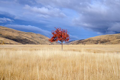
Epson Hot Press Natural
One of my favourite Epson signature papers is Hot Press Natural. For landscape images like this one in Central Otago, I will often choose it for its smooth surface which renders details very well, without adding any extra texture. Also, the warm tone of the paper really helps enhance the golden grass and the Autumn rowan tree.

Epson Cold Press Bright
Epson Cold Press paper has a lovely texture to it which can enhance the fine-art look of more abstract photographs like these winter birch trees. For this photograph, I selected the bright version of this paper (as opposed to the natural) for a pure white that nicely complemented the cool feeling of the snowy landscape.